Portfolio
Deep dives into every tool on stage
Portfolio
Your Portfolio is your public creator page — a designable surface built from blocks where visitors land when they click your name anywhere on PlotLight. It lives at plotlightstudios.com/portfolio/<your-username> and it's yours to build however you like.
This page covers how to build a Portfolio that earns a second look: the block system, the editor, themes, effects, and all the knobs in between. For the companion social feed where your characters post short in-character updates, see Stage Whispers.
Portfolio — What It Is
A Portfolio is a single page at plotlightstudios.com/portfolio/<your-username> that you compose from blocks. Each block is a self-contained tile that does one thing — show a bio, pin a featured character, list your most-played scenes, embed a music player, post a pull-quote.
Visitors see a finished page. As the owner, you see an editor where every block has a config panel, every block has visibility controls, and the whole layout can be themed, reordered, and decorated with visual effects.
There's nothing to set up. Every signed-in account gets a Portfolio. Until you start adding blocks, visitors see a clean creator-profile fallback with your avatar, bio, and library. Once you drop your first block onto the canvas, the editor takes over and your Portfolio becomes whatever you build.
Visitor View vs Owner View
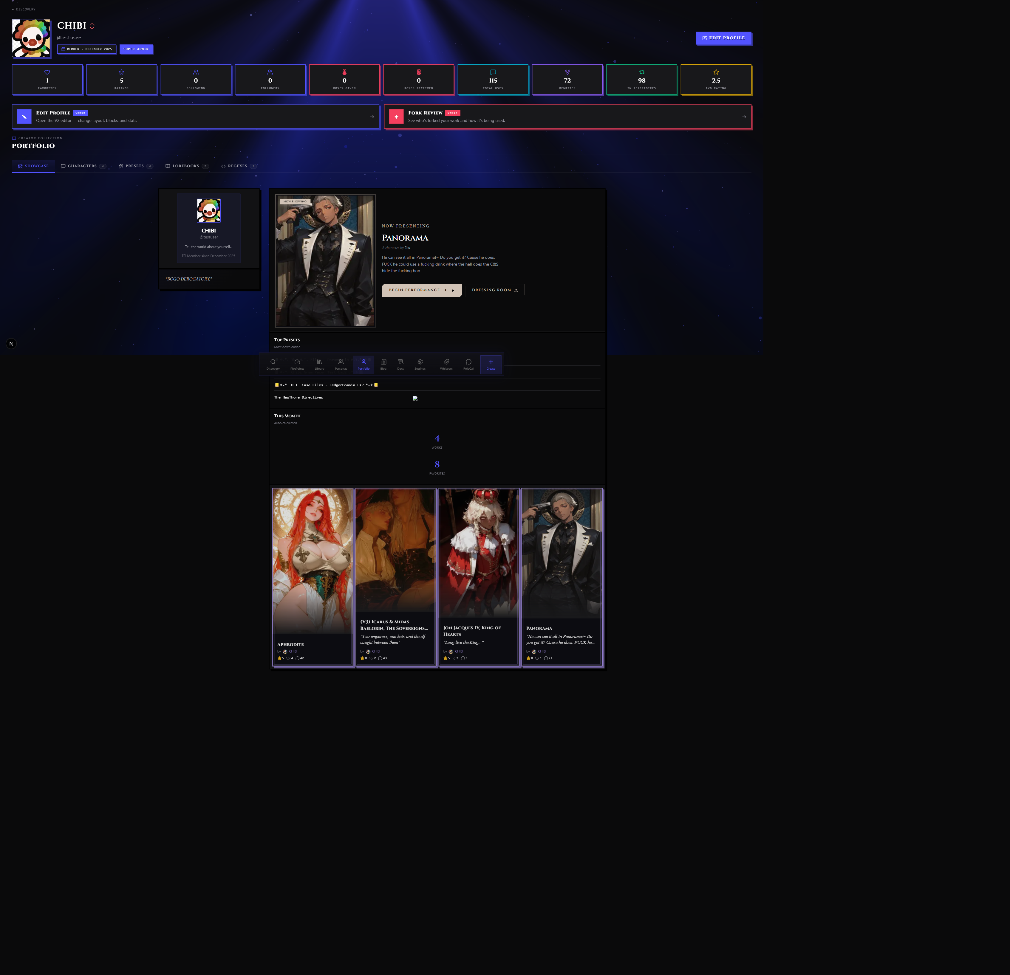
The same URL serves two audiences:
- Visitors see the published layout with owner-only blocks hidden, drag handles invisible, and any "draft" blocks filtered out
- Owners see the same layout but with the editor available, plus owner-only blocks (fork moderation, reports inbox) visible in their normal positions
The owner can preview as a visitor at any time — the editor has an As Visitor toggle that drops a ?asVisitor=1 flag on the URL. This forces the page to filter owner-only blocks and hide the editor chrome, so you can see exactly what a stranger will see.
Claiming a Username
Before your Portfolio has a clean public URL, you need a claimed username. New accounts have a generated handle (e.g. user-a1b2c3); the editor surfaces a Claim Username prompt the first time you save changes in the v2 editor. Pick a username, claim it, and your Portfolio moves from /portfolio/<random-id> to /portfolio/<your-username>.
The username is also what shows up in your character attribution, fork chains, and the @-mention chip on your Whispers. Pick something you can live with — username changes are allowed, but the old URL keeps redirecting to the new one so you don't lose visitors who bookmarked the original.
Block Types
Blocks are organized into seven categories in the v2 editor palette: Identity, Content, Activity, Owner, Social, Embeds, Structural. The palette filters by category chip, and each block has a default size, a list of allowed sizes, and a config schema that drives what you can tweak in the inspector.
There are thirty-one blocks in total. Eleven are legacy blocks carried over from the first portfolio system; twenty are new blocks built for the v2 editor. They all live in the same palette and use the same inspector.
Identity Blocks
These are about who you are. They're the first things visitors should see.
| Block | What it does |
|---|---|
| Banner | Cover image, gradient strip, solid color, or pattern at the top of your page. Supports a handle text, an eyebrow line (volume/issue style), accent stripe, and a cinematic-cover variant with magazine atmospherics. |
| Bio | Standalone short-bio block in italic Cormorant serif by default. Five variants: paragraph, pull quote, bordered card, signature line, manifesto with oversized opening quote glyph. |
| Epigraph | A pull-quote with attribution. Five variants: classic, oversized "pulled" hero, decorative-mark with huge curly quote, framed card, and inline-attribution single-line. Can appear multiple times on a page. |
| Identity | The legacy profile block — avatar, display name, handle, short bio. Useful for compact identity strips when you don't want a full banner. |
| Badges | Achievement badge row. Pick from preset badges (e.g. "100 Forks", "Featured Creator") and your own custom badges. |
| Quote | A short featured tagline. Lighter than Epigraph — meant for a single line you want to repeat across the page. Can appear multiple times. |
Content Blocks
These pin what you make.
| Block | What it does |
|---|---|
| Featured Pin | The "Now Showing" block. Pin a single Character, Preset, Lorebook, Persona, or Guide with a pill label, tagline, and CTA button. The pinned piece gets a gold accent treatment. |
| Featured Chat | Pin a single Chat session you want to spotlight — your highlight reel from a memorable scene. Shows message count and last-played timestamp. |
| Curated Carousel | A mixed-content shelf. You build the carousel (Characters, Presets, Lorebooks, Personas, Prompts all in one row) in the library carousel editor, then drop the shelf onto your Portfolio. Multiple carousels per page allowed. |
| Crossover Showcase | Pair characters that work well together. Each pair shows both characters side by side with optional pairing notes. |
| Latest Drops | Auto-updating ticker of your most recent uploads. Pick which content types appear (characters, presets, lorebooks). |
| Repertoire Showcase | Lists your content that's been pulled into other creators' repertoires, with usage counts. A "look how much my work gets played" block. |
| Most Played | The characters you keep coming back to — by scene count, by recency, or by chat count. |
| Recent Scenes | Your most-recent chat sessions in time order, with message count and last-played. |
| Featured Character | Single character spotlight (the legacy auto-pull featured block). |
| Character Card | Embedded character card for inline placement. Can appear multiple times. |
| Content Gallery | Grid of your characters, personas, presets, or lorebooks. Pick the content type, choose column count. |
Activity Blocks
Show that the lights are on.
| Block | What it does |
|---|---|
| Stats Marquee | Cinzel-serif ticker of your numbers — total uses, rewrites, repertoires, average rating, follower count. Pick which stats appear, in what order, and what separator to use between them. |
| Activity Feed | A scrolling list of recent events on your content: favorited, rewrote, added to repertoire. |
| Now Playing | A single-line "what I'm doing right now" block. Two modes: Manual (you type text + emoji yourself) or Auto-Session (pulls live from your active chat). |
| Stats Grid | Numeric stats laid out in a grid (legacy stats block). |
Owner-Only Blocks
These appear only when you're viewing your own Portfolio. Visitors never see them — the server filters them out before the page renders.
| Block | What it does |
|---|---|
| Stage Door | Compact fork-moderation block. Shows recent forks of your published work with similarity scores. Lets you triage forks without leaving your Portfolio. |
| Fork Pulse | A live feed of forks-in-progress with similarity bars, color-coded for rule breaches. |
| Use Pulse | Vanity feed: new chats, new repertoires, new favorites, new roses on your content. |
| Reports | Small CTA card linking to your creator reports inbox. Shows pending counts. |
Social Blocks
| Block | What it does |
|---|---|
| Connections | Overlapping avatar pile of your followers (or "connections" — followers + mutual follows). Compact, designed to sit in a header strip. |
| Following Grid | An avatar grid of who you follow. Configurable columns and row count. |
| Testimonials | Reviews left on your content. Filter by minimum rating, pick whether to show stars, choose card or list layout. |
Embed Blocks
External links and media.
| Block | What it does |
|---|---|
| External Link | A linkout card. Optional Open Graph preview (auto-fetched title, image, and description from the destination page). Multi-instance. |
| Music Player | Audio file embed. Only allowlisted hosts work — SoundCloud, Spotify, Apple Music, Bandcamp, or a direct audio file URL (mp3, ogg, wav, m4a, aac, flac, opus). No autoplay; visitors must press play. |
| Embed | Sandboxed iframe for allowlisted services: YouTube, Spotify, SoundCloud, Vimeo, Twitch, CodePen, Replit. URL gets validated server-side; non-allowlisted hosts are blocked. |
| Social Links | Row of social icons (the legacy social-links block). |
Structural Blocks
The connective tissue.
| Block | What it does |
|---|---|
| Section Header | Eyebrow line + title + horizontal rule. The title supports a two-color split (head white + tail in lightened accent) and an optional Roman numeral. |
| Divider | A short "Intermission" strip with optional decorative dots and a small eyebrow line. |
| Text | A general-purpose rich-text block for prose, FAQs, anything that doesn't fit elsewhere. Multi-instance. |
| Image | A custom image (PNG / WEBP). Configurable fit, alt text, optional caption. Multi-instance. |
| Custom | A build-your-own block — header + sub-header + content area. Useful when nothing else fits. Multi-instance. |
A block marked multi-instance can appear multiple times on the same Portfolio. Most blocks are single-instance (you only get one Banner) — the multi-instance flag exists for blocks like Epigraph, Text, Image, Character Card, External Link, Quote, Curated Carousel, and Custom where it makes sense to have several.
The Block Editor
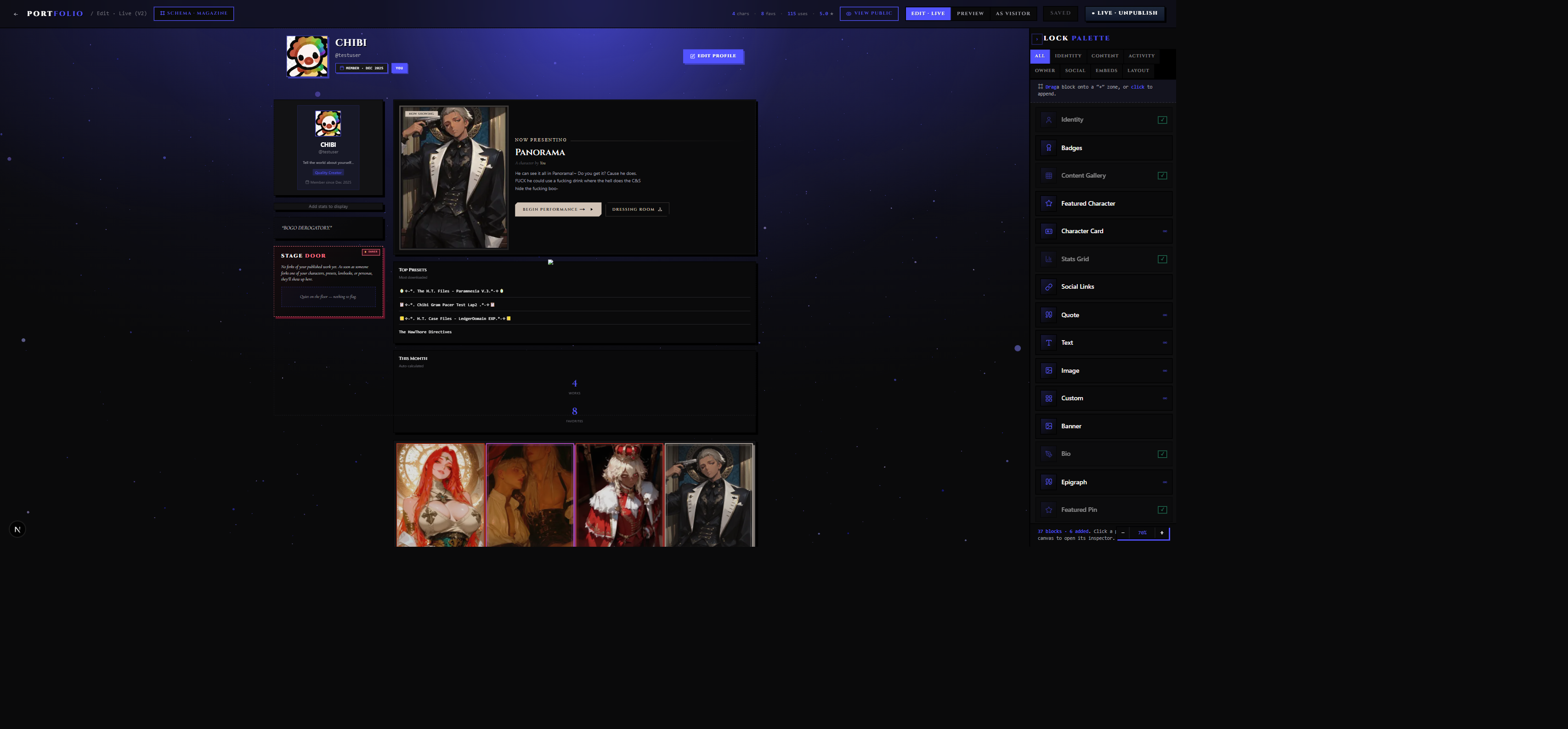
The Portfolio editor lives at plotlightstudios.com/portfolio/edit/v2. It's a side-by-side: live canvas on the left, block palette on the right, inspector that slides in when you select a block.
Adding a Block
The palette on the right has a category filter chip row (Identity / Content / Activity / Owner / Social / Embeds / Structural) and a search bar. Drag a block from the palette onto the canvas, or click it to drop into a default position.
Every block comes pre-configured with a sensible default — text content, a placeholder image, a pre-picked accent. Drop, then tweak.
Single-instance blocks (most of them) grey out in the palette after you drop one — the editor won't let you add a second Banner or a second Identity strip. Multi-instance blocks show an infinity badge in the palette and stay clickable forever — drop as many Epigraphs or External Links as you want.
The Inspector — Four Tabs
When you select a block on the canvas, the inspector panel opens with up to four tabs:
| Tab | What's inside |
|---|---|
| Block | Per-block field schema. This is where the actual content lives — the text of your bio, the chosen Featured Pin, the colors of your Banner. Every block has different fields. |
| Theme | Theme preset gallery. Apply a preset to give the block a coherent look without per-property tweaking. |
| FX | Visual effect chips. Toggle individual effects on or off. Effects that don't apply to the current block type appear greyed out so you don't toggle dead config. |
| Visibility | Who can see this block: Public, Followers, Private, Owner. |
Not every tab appears on every block. The Block tab is always there; Theme, FX, and Visibility are gated by the schema — the Banner block exposes Theme and FX, the Reports block doesn't.
Theme Presets
The Theme tab shows six theme tiles. Tap one to apply it to the selected block; tap again to switch. There's also an Apply this theme to all blocks on the page button for one-tap site-wide reskinning.
| Theme | Look |
|---|---|
| Marquee | Pink-violet gradient over a near-black base. The default "RoleCall stage" look. |
| Vintage Bill | Burnt umber over deep rust. Old playbill atmosphere. |
| Glow | Radial violet glow centered on black. Spotlit. |
| Minimal | Solid charcoal. Quiet, no decoration. |
| Cream Paper | Warm off-white with black text. The light-mode look. |
| Cyberpunk | Cyan-magenta gradient over pure black. Neon. |
Theme presets live on the block where you apply them — siblings keep their own theme unless you use the "apply to all" button. Themes compose with FX effects — pick a Theme as a base, then add effects on top.
FX — The Effect Chips
The FX tab is a row of toggle chips. Each chip turns one named visual effect on or off for the selected block. Effects compose — a Banner with Stage Spotlight, Curtain Fade, and a slow Shimmer is one block, and each effect renders on its own layer without fighting the others.
| Effect | What it does |
|---|---|
| Shine border | Animated border sweep that travels around the block's edge. |
| Magic card glow | Cursor-tracked spotlight that follows the visitor's pointer across the block. |
| Glassmorphism | Frosted blur with a translucent tint, like a smoked-glass overlay. |
| Marquee bulbs | Old-theater bulb strip around the block edge. Limited to Banner, Identity, Featured Pin, Section Header, Divider. |
| Stage spotlight | Top-center bloom that washes the block in soft light. Limited to identity / hero-style blocks. |
| Curtain fade | Left-and-right velvet vignette, like stage curtains framing the content. Limited to hero / gallery / carousel blocks. |
| Neon hairline | A glowing 1px line under the block's edge. |
| Gradient text | Paint headers and titles with a multi-stop gradient. Limited to text-heavy blocks. |
| Roman numerals | Drops an I / II / III numeral in the block corner. Limited to Section Header, Divider, Gallery, Curated Carousel, Crossover Showcase. |
| Cormorant pull-quote | Oversized italic blockquote treatment. Limited to Bio, Epigraph, Quote, Testimonials, Divider. |
| Cinzel text-shadow | 3D punchy text-shadow on headers. Limited to identity / hero / divider blocks. |
| Accent ring | Inset 4px border in your accent color. |
| Neobrut shadow | A hard 6px offset shadow under the block — flat, no blur. |
| Scanlines | CRT-style horizontal lines layered across the block. |
| Letterpress noise | A fine grain texture, like printed-paper noise. |
Effects flagged "Limited to…" only render on the listed block types. Toggle them on a different block and the chip greys out — the config is preserved, but nothing changes visually until you apply the effect to a matching block.
Per-Block Visibility
Visibility is a four-way control, set per block in the Visibility tab:
| Setting | Behavior |
|---|---|
| Public | Anyone viewing the Portfolio sees this block. The default for most blocks. |
| Followers | Only accounts following you see the block. Visitors who haven't followed you see a gap where the block would be. |
| Private | Hidden from everyone except you. Useful for blocks you're still drafting. |
| Owner | Same as private, but used for blocks that wouldn't make sense to a visitor anyway (your Reports inbox, your Fork Pulse). Owner-only blocks are filtered server-side, so they never even reach the visitor's browser. |
Blocks marked as owner-only by their type (Stage Door, Fork Pulse, Use Pulse, Reports) default to Owner visibility and can't be made public — the server filters them regardless of what the visibility setting says.
Inline Editing
Most text on a block can be edited in place. Click a banner's handle text and start typing. Click a Bio's prose and the field turns into a multiline editor. The inspector still works for everything else, but you don't need to open it just to fix a typo.
The inline editor honors the same fonts and sizing the rendered block uses — what you type during editing is what visitors will see. There's a small toolbar above the active text field for bold, italic, link, and a few headers; the rest is per-block (the Section Header's two-color title split, for example, is configured through the inspector, not the inline editor).
The Banner Block in Depth
Banner is worth a dedicated subsection because it's the block that sets the tone for everything below it.
It has five variants:
| Variant | Look |
|---|---|
| Gradient | A multi-stop color gradient. Pick up to five color stops and drag the angle slider for direction. |
| Solid | One color, edge to edge. The minimalist option. |
| Image | A background image you upload (JPG / PNG / WebP up to 8 MB). Pick a focal point so the right part stays centered when the banner reshapes on small screens. Drag the opacity slider to mute the image into a backdrop. |
| Pattern | A repeating pattern overlay (dots, stripes, grid, noise, checkerboard, diagonal) over a base color. |
| Cinematic Cover | An image variant with a dim + vignette layered on top — magazine-cover atmospherics. Use it when you want a big photograph that doesn't fight your overlaid handle text. |
Banner also exposes height (80–360 px), a border-bottom style (none / accent / hard / dashed), and a separate "pinstripe" toggle that drops a thin accent line below the banner without committing to a full border.
Per-Block Field Schemas
Every block exposes a different set of fields in the Block tab of the inspector. Some have just a few (Divider: an eyebrow text and a "show dots" toggle). Some have dozens (Banner has variant, height, gradient stops, image fit, image focal point, pattern, pattern color, border bottom, handle text, eyebrow, accent stripe, plus all the universal theme/FX/visibility tabs).
The fields are conditional — the inspector only shows the controls that apply to your current settings. Pick the "Pattern" Banner variant and the pattern-color picker appears; switch back to "Gradient" and the pattern controls hide while the gradient-stop editor shows. You don't have to mentally filter what applies; the editor does that for you.
Reordering and Resizing
Blocks live on a grid. Each block has a default size (e.g. Banner is 12 columns × 1 row, Bio is 6 × 2) and a list of allowed sizes. Drag the resize handle on a selected block to grow or shrink it within those allowed bounds.
To reorder, drag the block up or down. The layout reflows around it. Some layout schemas (Magazine, Theater Bill, Workshop) place blocks into named slots — there, dragging a block to a different slot routes it there automatically based on the block's category.
Layout Schemas
The Portfolio editor offers four structural layouts plus a fallback:
| Schema | Shape |
|---|---|
| Default Profile | The non-bento fallback. Standard creator-profile UI — avatar, stats card, library tabs. What untouched accounts get. No block drops; this layout doesn't accept the bento system. |
| Block Stack | A vertical reorderable stack. Simplest schema; blocks pile top-to-bottom. Variant A. |
| Magazine Spread | A 340px rail on the left plus a main column, with an optional cover masthead at the top. Identity blocks land in the rail; content blocks fill the main column. Variant B. |
| Theater Bill | Centered hero with "Tonight's Bill" eyebrow, plus three numbered Acts (I — The Cast, II — The World, III — The Closer) and a floating owner-only Backstage Pass panel. Variant C. |
| Workshop | A tab bar at the top (Library / Forks / Activity / About / Reports / Settings) plus a Pulse rail on the right for owner-only widgets. Designed for creators with a lot to show. Variants D + H. |
The schema picker is in the editor's settings panel. Switching schemas re-routes existing blocks into their best-fit slot. Schemas can be re-picked freely; your block data is preserved. Picking a schema also seeds a few mandatory default blocks if the slot is empty — Block Stack seeds a Banner, Identity, Stats Marquee, and Gallery; Magazine seeds an Identity + Bio + Stats + Stage Door in the rail and a Featured Pin + Gallery in the main column; Theater Bill seeds an Identity hero, a Stats Marquee, a Gallery in Act I, a Repertoire Showcase in Act II, and a Featured Pin in Act III; Workshop seeds the compact hero, Library Gallery, Stage Door in Forks, Activity Feed, About Bio, Reports card, and Fork Pulse in the Pulse rail.
Loose Cells
Inside any schema, blocks can be either slot-bound (snapped to a named region) or loose (free-roam, positioned anywhere on the canvas). Loose cells let you drop a Bio in the middle of a Magazine layout without it being forced into the rail. Drag a block off its slot into the open canvas to make it loose; drag it back into a slot to re-bind.
Loose cells survive schema switches — if you put a block at an absolute position and then switch schemas, the cell keeps its freeform coordinates regardless of how the new schema would have routed it.
Effects and Visual Treatments
Beyond the FX chip toggles, every block exposes a deeper set of CSS-driven effects you can configure in the Block tab. These are the same effects available across the editor, exposed through UI controls — no CSS knowledge needed.
| Effect group | Examples |
|---|---|
| Glow | Soft, Neon, Pulse, Layered, Inner, Rainbow |
| Borders | None / Solid / Accent — with adjustable color |
| Background presets | Marquee gradient, Vintage paper, Stage spotlight, mesh gradients with multi-stop color blobs |
| Image filters | Vintage / Matte / Black-and-white / Vivid / Cool / Warm / Cinematic preset, plus individual brightness, contrast, saturation, sepia, hue rotate, blur, grayscale sliders |
| Shape masks | None / Circle / Vignette / Diamond / Hexagon / Star / Custom uploaded PNG — with feather + size + position controls |
| Color overlays | Tint with any hex color, adjustable opacity, with CSS blend modes: multiply, screen, overlay, darken, lighten, color-dodge, color-burn, hard-light, soft-light |
| Glass / Neumorph | Frosted-glass blur with tint, or neumorphic soft-shadow surfaces |
| Animations | Pulse, Float, Bounce, Shake, Shimmer, Fade |
Effects compose. A Banner with a vintage image filter, a vignette mask, a soft glow, and a slow shimmer is one block — and it'll render correctly because each effect lives on its own layer of the block wrapper without fighting the others.
Saving and Publishing
Saves are explicit. Make changes, click Save in the editor header. Your draft is preserved; visitors still see the last published version. When you're happy, click Publish and the draft flips to live.
You can keep working in the editor after publishing — your in-progress changes don't leak to visitors until you publish again.
Embed and audio URLs get validated at save time. If you paste a YouTube URL into a CodePen-shaped Embed block, the save fails with a message explaining which block has the mismatch — the editor refuses to publish a layout that would render an embed pointing somewhere the allowlist doesn't cover.
Featured Content
Three blocks are designed around the idea of spotlighting one thing: Featured Pin, Featured Chat, and Curated Carousel. They each need content to feature.
Featured Pin
When you drop a Featured Pin onto the canvas, the inspector shows a picker: choose a Character, Preset, Lorebook, Persona, or Guide from your library. The picked item's image, name, tagline, and stats populate the block.
The block has a few configurable surfaces:
| Field | What it does |
|---|---|
| Pin kind | Character / Preset / Lorebook / Persona / Guide. Switching this hides the previous selection and asks you to pick a new target. |
| Pin target | The actual library item to feature. Library picker opens when you click the slot. |
| Pill label | The little text chip above the title. Defaults to "Now Showing" but you can use "Featured", "Tonight Only", "Director's Pick", anything short. |
| CTA label | The button text. Defaults to "Begin Performance →" for characters. |
| Layout | Cover-left or cover-right. Picks which side the image sits on. |
| Cover ratio | Aspect ratio of the cover image (3/4, 4/5, 1/1, 16/9). |
| Show tagline | Whether the pinned piece's tagline renders under the title. |
Click the pin's CTA to launch a scene with that piece (for Characters), open it in the library (for Presets / Lorebooks / Personas / Guides).
The pinned reference is live. If you update the underlying character, the Featured Pin reflects it immediately. If you delete or unpublish the underlying content, the block shows an empty state — pick a new one from the inspector.
Featured Chat
The Featured Chat block points at one of your saved chat sessions — when a visitor clicks the CTA, they're taken to the chat detail page so they can read it through.
Configurable fields include the pill label (defaults to "Highlight Reel"), the pill's background color, the CTA label ("Resume scene →" by default), and toggles for showing the message count and last-played timestamp. Layout is portrait-left or portrait-right with the character's avatar.
Curated Carousel
Curated Carousel blocks pull from your library's carousel system. A carousel is a named, ordered list of content items — for example, "AI Romance Picks" containing five characters and two presets, in the order you want them shown.
You build carousels in the library, not in the Portfolio editor. The Portfolio block just references a carousel by ID. This means:
- You can drop the same carousel onto multiple pages
- Editing the carousel in your library updates every block that references it
- Carousels support drag-reorder, bulk add/remove, and per-item notes
The Curated Carousel block lets you toggle the "source pill" (the chip in the corner showing which carousel feeds the row) and pick a card size (small / medium / large). See Discovery & Library for the carousel editor.
Embed Safety
The Music Player and Embed blocks accept URLs, but only from a small allowlist of hosts. The same allowlist is enforced at save time and at render time — paste in a hostile URL and the editor rejects the save with a message telling you which block has the problem.
Music Player Hosts
| Source | What works |
|---|---|
| SoundCloud | Track and playlist URLs |
| Spotify | Tracks, albums, playlists |
| Apple Music | Track and album URLs |
| Bandcamp | Track and album URLs |
| Direct file | Any .mp3, .ogg, .wav, .m4a, .aac, .flac, or .opus URL (your own host, your CDN, etc.) |
The block plays inline with standard controls. There's no autoplay — visitors press play themselves.
Embed (Iframe) Hosts
The general-purpose Embed block accepts these services and refuses everything else. Each has its own URL shape; pasting a YouTube URL into a CodePen-shaped Embed won't pass validation.
| Service | What you can embed |
|---|---|
| YouTube | Videos and playlists |
| Spotify | Track / album / playlist players |
| SoundCloud | Track / playlist widget |
| Vimeo | Videos |
| Twitch | Stream players and clip players |
| CodePen | Pens |
| Replit | Workspaces |
All embeds run in a sandboxed iframe with per-service permissions — YouTube and Vimeo get encrypted-media for DRM video; CodePen and Replit get form-submit for their Run buttons. Other services run with the minimum set needed to function. No service runs with cross-site cookies; trackers and fingerprinters that depend on third-party cookies don't work inside the embed.
External Link OG Preview
The External Link block can fetch an Open Graph preview from the destination URL. Flip the toggle in the inspector and the editor pulls the destination page's title, description, and cover image, caching the result so visitors aren't pinging the destination on every page load. If the destination doesn't expose OG metadata, the toggle gracefully falls back to a plain title-and-URL card.
Bento Layouts
The Portfolio system is internally called the bento system — referring to the Japanese lunchbox where different items live in different compartments. Blocks are the compartments; your Portfolio is the box.
The bento system supports two coexisting modes on the same page:
- Slot mode — blocks snap to a schema's named regions
- Loose mode — blocks float freely at any x/y position you drag them to
These mix inside one layout. Magazine schema with three slot-bound blocks in the rail plus two loose Epigraphs scattered across the main column is a valid, common configuration.
Publishing Your Portfolio
Once you have blocks on the canvas and you've clicked Publish:
- Your page is live at
plotlightstudios.com/portfolio/<username> - Visitors can land there from your character pages, your library, the Discovery creator filter, the Connections block on someone else's Portfolio, or a direct URL
- Search engines index it (unless you toggle private mode in settings)
- It can be linked to and shared like any web page
Unpublishing reverts the page to the default creator profile fallback. Your block data is preserved — you can re-publish later without rebuilding.
Tips & Common Patterns
Lead with one Banner, then breathe. A page that opens with a strong Banner, a single Bio, and an Epigraph is more memorable than a wall of every block in the palette. Let the work do the talking — the Featured Pin and Curated Carousel are where visitors should spend most of their time.
Pick a theme, then commit. The six theme presets (Marquee, Vintage Bill, Glow, Minimal, Cream Paper, Cyberpunk) exist because consistent palettes read as intentional. Mixing four different themes across one Portfolio looks like indecision. Use the "Apply this theme to all blocks" button to push your pick site-wide in one tap.
Use Section Headers between content groups. Three blocks under a "— My Characters —" header reads more cleanly than three blocks in a row with no labeling. The Roman-numeral option on Section Headers is a free aesthetic win.
Owner-only blocks are not visitor-visible. This sounds obvious but it bites people: the Stage Door block looks great when you preview your Portfolio while logged in. Switch on As Visitor before publishing to confirm what strangers actually see.
Curated Carousels beat raw Gallery blocks. A Gallery is "every character I made." A Carousel is "the three characters I'm most proud of, in the order I want." Curate.
Don't pin a draft. Featured Pin blocks honor the published status of their target. Pinning a draft Character shows an empty state to visitors until you publish the underlying piece.
FX chips compose, but they're not free. Layering Shine Border, Magic Card Glow, Marquee Bulbs, Scanlines, and Letterpress Noise on a single Banner looks busy and runs the visitor's GPU hot. Two or three effects per block is usually the sweet spot.
Skip the Portfolio editor if you only have one or two characters and don't plan to add more. The default creator profile fallback already shows your library, your avatar, and your bio — it's a reasonable page out of the box. Build a custom Portfolio when you have something worth pinning and a story worth telling about how the work fits together.
Don't lean on the Featured Pin for content that isn't your best. Pin the character or piece you'd want a new visitor to see first. Pinning your most-recent upload by reflex turns the Featured Pin into another timeline — which is what Latest Drops is for.
Don't crowd the Workshop tabs with one-block tabs. The Workshop schema's About / Activity / Forks / Reports / Settings tabs work best when each holds two to four related blocks. A tab with one block per tab feels empty; consolidate into Block Stack instead.
Fork Review — See Who's Built On Your Work
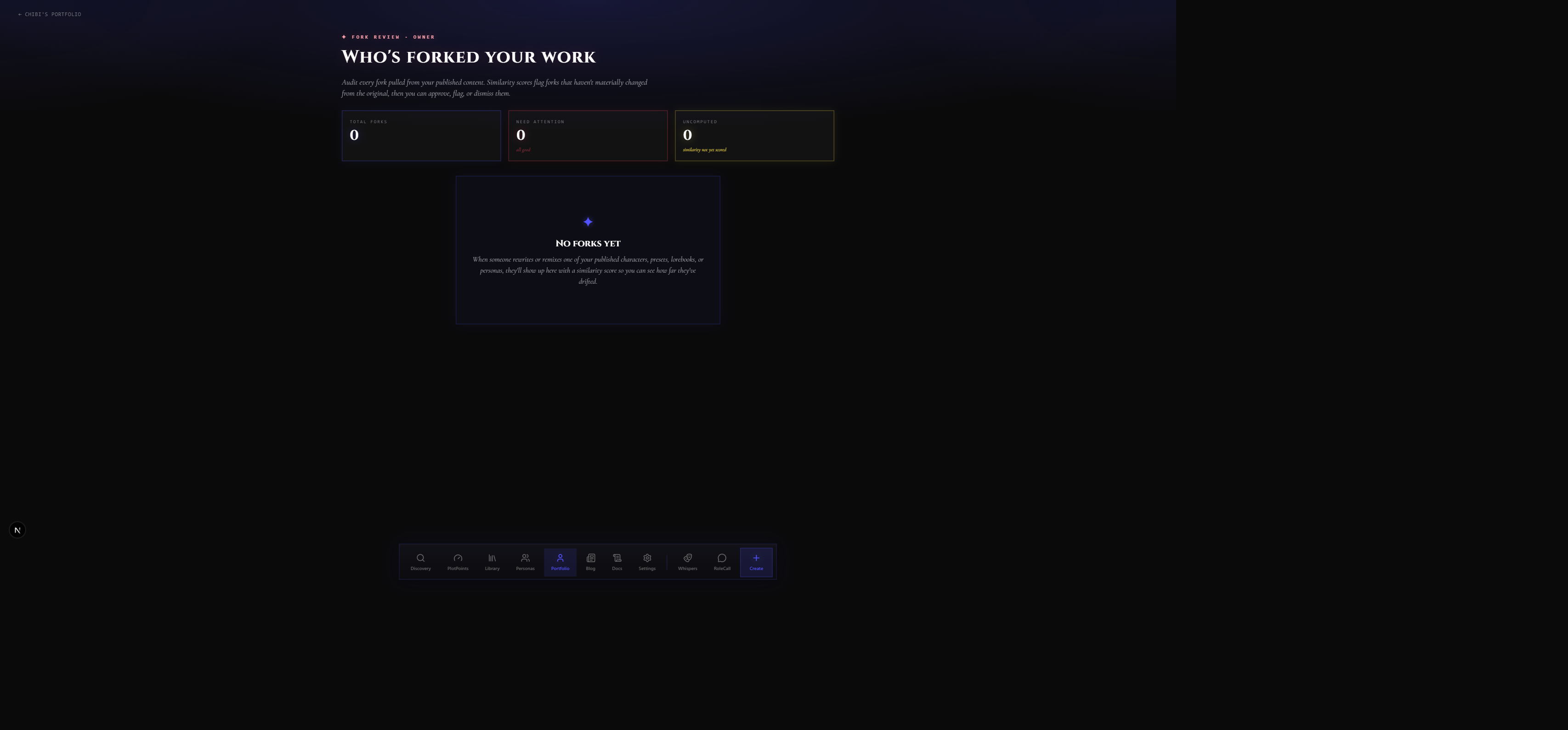
The Fork Review surface at /portfolio/<your-username>/forks is owner-only. Visitors never see it; you do. It's the full downstream picture of your creative output — every piece of your published content across all content types (characters, presets, lorebooks, personas, prompts, series, guides, regex scripts), and for each one, the complete chain of forks that branched from it.
For each fork in the chain you can see who forked it, when, what they named their version, whether they published it, and how that fork is performing — chat count, favorites, and rating. If someone forked your character and that fork was itself forked again, the chain keeps extending. You're always named at the root, no matter how many hops away the downstream fork is.
How to Use It
- Track creative influence. See which of your pieces has the most active downstream community and how that community's work compares to yours.
- Spot inspired remixes. Find creators who are iterating on your work in interesting directions and reach out directly.
- Identify mis-tagged forks. If someone forked your lorebook and republished it under a different content type without attribution, Fork Review is how you find it.
Fork Attribution
Attribution is automatic and permanent. Every fork records the full lineage at the time it's created — a fork of a fork still names you as the original creator, with each step in the chain listed in order. The chain never breaks regardless of how many generations downstream the content travels.
Notifications
You can subscribe to fork notifications per content piece. Open the details panel for any piece in Fork Review and toggle Notify me when this is forked. You'll get a notification when a new fork is created from that piece or from anything downstream of it. You can also set a threshold — notify only when a fork is published, not just created.
Filtering and Bulk Operations
The Fork Review surface filters by content type, fork status (draft, private, published, archived, pending_review), and how recently a fork was published. Use the bulk selector to download a filtered list or to flag multiple forks for moderation review at once.
Fork Rules — What Forkers Can and Can't Do
Fork Rules let you decide, in advance, how your published content can be reworked. They ship attached to your content at publication time and are enforced at the moment a forker tries to publish their version.
Where to Set Them
Every content editor has a Publishing Controls block. Inside it is a Fork Rules sub-section — click it to open the rules modal. Set your rules before you publish. When you publish, the rules attach to the content permanently for that version. You can tighten the rules later; see the note on changing rules below.
What Fork Rules Control
| Rule | What it does |
|---|---|
| Attribution required | Forks must keep your name visible as the original creator. On by default. |
| Same license forward | Forks must apply the same fork rules to their own version — copyleft-style. Off by default. |
| No commercial use | Forks can't be sold or included in a paid product. |
| No re-publication | Forks are private use only and cannot be re-published to Discovery. |
| No derivative content types | Prevents forkers from republishing your character as a preset, your lorebook as a guide, and so on. |
| No removal of trigger warnings | Forks must preserve your original content rating and severity flags. Forkers can add warnings but not remove them. |
When a Forker Breaks the Rules
If a forker tries to publish with a rule violation, the publishing dialog blocks them with a specific error explaining which rule is being broken and what they'd need to change to comply. Rule-violating forks that slip through edge cases can be flagged by any user and are reviewed by moderators.
Fork Rules and Lineage
Rules attach at every level of the chain. If you set "Attribution required" and "Same license forward" on your character, a fork-of-a-fork must still credit you and must still apply those same two rules to its own downstream. When two rules at different levels in the chain conflict, the more restrictive one wins — forks can never escape a rule that was set by any ancestor in their chain.
Changing Rules After Publication
You can tighten fork rules on your published content at any time. Forks that were made before the change are grandfathered — they keep the rules they were published under. The new, stricter rules apply to any forks created after your change. You cannot loosen fork rules on content that already has downstream forks using the stricter version.
Creator Moderation and Reports
How Reports Work
Any user can flag a piece of content or a creator profile. Flags go directly to PlotLight's moderation queue — they don't land in your inbox as raw accusations. You'll receive a notification if your content is flagged, showing the category of the report (e.g. "Content rating mismatch" or "Attribution missing"), but not who filed it or the full text they submitted.
What Happens to Flagged Content
- Content that receives multiple flags within a short window is automatically pulled from Discovery feeds while it's under review. Its status moves to
pending_review— visitors who have the direct link can still reach it, but it stops appearing in browse and search results. - A single flag from a high-trust reporter can also trigger an immediate
pending_reviewtransition without waiting for a threshold. - Moderators review the piece, compare it against the fork rules of any upstream content, and either restore it to
published, leave it inpending_reviewpending creator action, or archive it. - Banned accounts have their published work hidden site-wide. The data isn't deleted — moderation history is preserved even if the account is permanently removed.
The Reporter Trust Score
Every account has a reporter trust score that rises and falls based on the outcome of their reports. Accurate reports — ones where a moderator upholds the flag — increase your score. Frivolous or retaliatory reports that are dismissed decrease it. High-trust reporters' flags are reviewed faster; very low-trust reporters' flags are deprioritized and may trigger a temporary cooldown.
Cooldowns
Report submission has a per-user cooldown that resets after each flag. If your reports are repeatedly dismissed as frivolous, the cooldown length increases. A notice in the flag dialog tells you when your next submission is available.
Creator-Side Experience
If your content is flagged you'll see:
- A notification with the report category
- The specific piece that was flagged
- The current status of the review
- What you can change to resolve it (if the path is clear, e.g. "Add the required trigger warning")
You won't see the reporter's identity or the exact text of their report.
Suspensions and Bans
Temporary suspensions show the end date and a summary of which moderation action triggered the suspension. During a suspension your published work stays visible but you can't publish new content. Permanent bans hide the account and all its work site-wide. Moderation history is retained internally.
Appeals
If you believe a moderation action was incorrect, the notification includes an Appeal this decision link. Appeals go to a second moderator who wasn't involved in the original review. You can provide context and link to supporting evidence (e.g. your own original creation date predates the piece that was used to flag yours). Appeals are typically resolved within a few days. A decision that was appealed and overturned won't count against your standing.
Related Docs
- Stage Whispers — the companion social feed where your characters post in-character
- Characters — the cards that power your Portfolio content
- Library — where Carousels are built, where forks come from
- Personas — the player-side counterpart to Characters