Decorating Your Portfolio
Start your journey on the stage
Decorating Your Portfolio
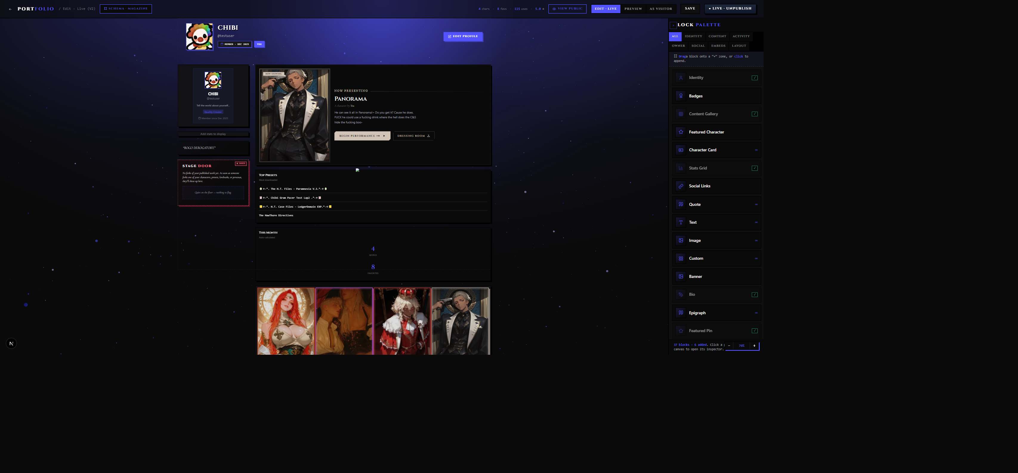
Your Portfolio is the page a stranger lands on when they click your name anywhere on PlotLight. It lives at plotlightstudios.com/portfolio/{your-username}, it's public by default, and it's yours to build however you like.
This guide walks you through the whole thing — from opening the editor for the first time to publishing a finished page. By the end you'll have a working Portfolio with real blocks, a theme, and a clear sense of which controls do what.
1. Where Your Portfolio Lives
Your Portfolio has two URLs.
The public view — what visitors see:
plotlightstudios.com/portfolio/{your-username}
The editor — owner-only, never shown to visitors:
plotlightstudios.com/portfolio/edit/v2
If you haven't claimed a username yet, the public URL uses your account ID instead of a name (e.g. /portfolio/user-a1b2c3). The editor will prompt you to claim one the first time you save changes. Pick something you can live with. Username changes are allowed later, but the old URL redirects to the new one — so bookmarks and shared links don't break.
2. Visitor View vs Owner View
The same URL — plotlightstudios.com/portfolio/{your-username} — serves two completely different audiences.
Visitors see the published layout: finished blocks, no drag handles, no edit chrome. Blocks you've marked as owner-only never appear — they're filtered out before the page even reaches the visitor's browser.
You see the same layout, but with the editor available. Owner-only blocks (your fork moderation queue, your reports inbox) appear in their normal positions so you can work with them while logged in.
The fallback view
Until you drop your first block onto the canvas, visitors see a clean creator-profile fallback: your avatar, your display name, your bio, and tabs for your library content. It's a respectable page out of the box. You're not starting from zero — you're adding to something that already works.
Once you drop and publish your first block, the editor takes over and the fallback is replaced by whatever you build.
Previewing as a visitor
The editor has a View public portfolio button in the toolbar. Click it to open the live public URL in a new tab — you'll see exactly what a stranger sees, with all editor chrome stripped away.
3. Opening the Editor
Two paths get you there.
From your account menu: Click your avatar in the top-right of any PlotLight page. The dropdown includes a Portfolio link that routes you to your public page. From there, an Edit Portfolio or Open Editor button appears in the header (visible only to you as the owner).
Direct link:
Navigate straight to /portfolio/edit/v2.
The editor is owner-only. Visitors who try to reach the edit URL are redirected to the public view.
4. The Editor Toolbar
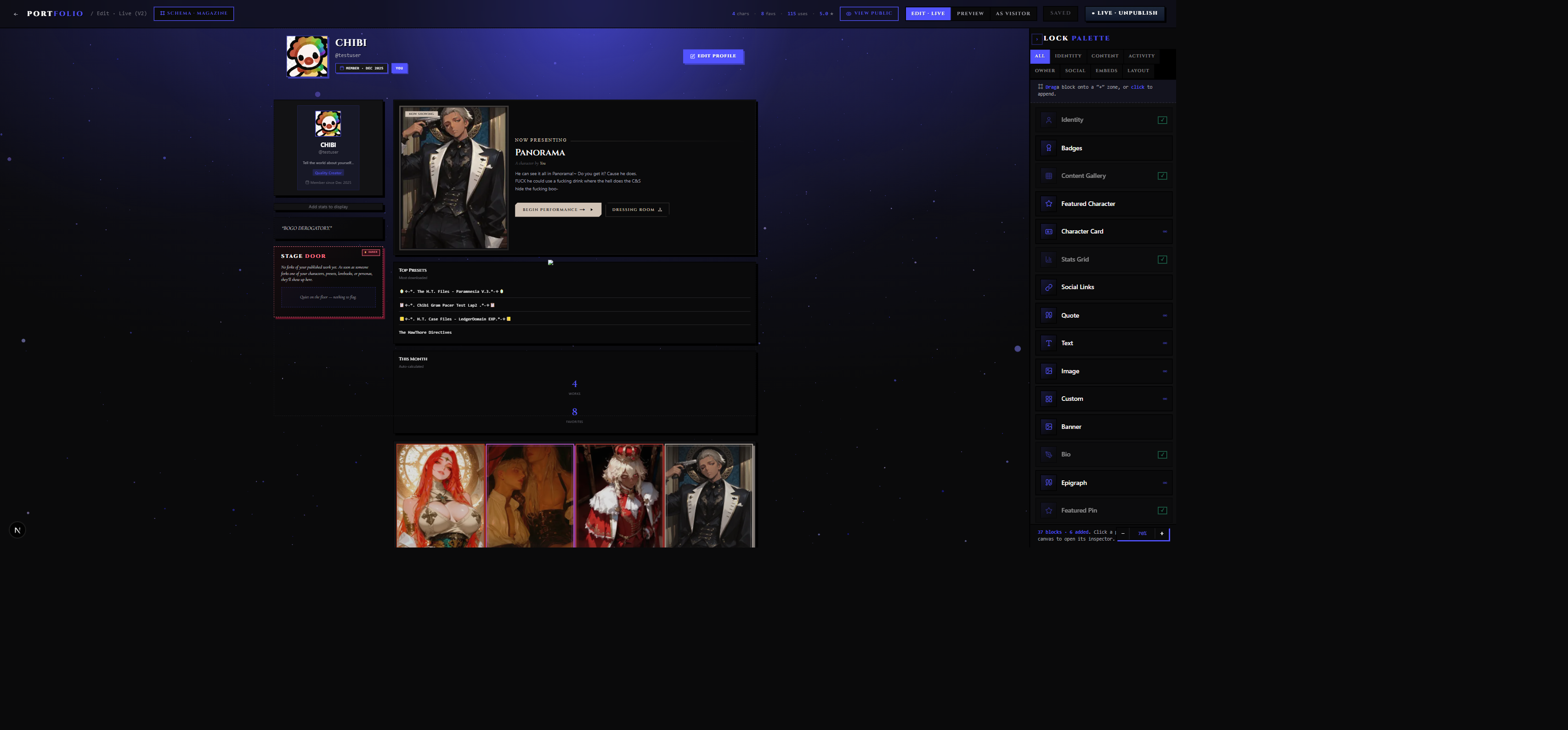
The toolbar runs across the top of the editor. Here's what each button does.
| Button | What it does |
|---|---|
| View public portfolio | Opens your live public Portfolio in a new tab so you can preview exactly what a visitor sees. The URL shown in the tooltip confirms which portfolio you're previewing. |
| Switch layout schema | Swaps the underlying layout system (Block Stack, Magazine Spread, Theater Bill, Workshop, or the default creator-profile fallback). See the Layout Schemas section below for what each one looks like. |
| Publish / Unpublish | The visitor-visibility toggle. When published, visitors see your Portfolio. When unpublished, they see the creator-profile fallback. The button tooltip updates to reflect the current state. |
| Bring forward | Moves the selected block one step forward in z-order — useful when two loose blocks overlap and you need to control which sits on top. |
| Send backward | Moves the selected block one step back in z-order. |
| Delete block | Removes the currently selected block from the canvas. There's no undo, so confirm before you click. |
| Hide palette | Collapses the block palette on the right side of the editor, giving you more canvas room to see what you've built. Click again (or a toggle icon that appears) to bring the palette back. |
| Zoom out / Reset to 100% / Zoom in | Canvas zoom controls. Zooming out lets you see the whole layout at once. Zoom in to work on a dense block. Reset snaps back to 100%. |
5. Block Types You Can Add
Blocks are the building material of your Portfolio. Every block does one specific thing. They live in the palette, organized by category. Here's what's available and what each one is for.
Identity
These blocks answer "who are you?"
Banner — The hero at the top of your page. Pick from five variants: a color gradient, a solid color, a background image you upload, a repeating pattern, or a cinematic-cover photograph with a built-in dim and vignette. It exposes height, border-bottom style, and a "pinstripe" accent line. Start here.
Bio — A standalone prose block in italic Cormorant serif by default. Five variants: paragraph, pull quote, bordered card, signature line, and manifesto. Use it to tell visitors who you are and what you make.
Epigraph — A pull-quote with attribution. Lighter than a full Bio; good for a line you want to repeat across the page. Multi-instance — you can have several.
Identity — The legacy compact profile block: avatar, display name, handle, short bio. Good for a narrow-column slot when you don't want a full Banner.
Badges — An achievement badge row. Choose from preset badges (earned from activity milestones) and add your own custom ones.
Quote — A very short featured tagline, lighter than an Epigraph. Multi-instance.
Content
These blocks showcase what you make.
Featured Pin — The "Now Showing" block. Pin a single Character, Preset, Lorebook, Persona, or Guide from your library. The pinned piece gets a gold accent treatment, a configurable pill label ("Now Showing," "Tonight Only," "Director's Pick"), and a CTA button. This is the first block most visitors read closely — pin your best work here.
Curated Carousel — A hand-picked shelf of content items you select yourself. Unlike a gallery (which shows everything), a carousel is exactly what you choose and in the order you want. You build carousels in your Library, then reference them here. Multiple carousels per page are allowed. See Discovery & Library for the carousel editor.
Top Presets / Top Characters — Auto-curated shelves based on your stats (ratings, chat count, fork count). You pick which metric drives the ranking; the block keeps itself current.
This Month — A recent-activity rail showing what you've published or played in the current calendar period. Keeps itself updated automatically.
Marquee Stats — A Cinzel-serif ticker of your numbers: total uses, rewrites, repertoires, average rating, follower count. Pick which stats appear and in what order.
Featured Chat — Pin one of your saved chat sessions to spotlight as a highlight reel. Visitors can read the chat through. Good for sharing a scene you're proud of.
Featured Whisper — Pin a single Stage Whisper to spotlight on your Portfolio. Links back to the Whisper detail page.
Content Gallery — A grid of your characters, personas, presets, or lorebooks. Pick the content type and column count. Good for showing "everything I've made."
Latest Drops — An auto-updating ticker of your most recent uploads. Pick which content types appear.
Structural
The connective tissue.
Section Header — An eyebrow line, a title, and a horizontal rule. Supports a two-color title split and an optional Roman numeral. Use it to break your Portfolio into named acts.
Divider — A short "Intermission" strip with optional decorative dots. A lighter separator than a full Section Header.
Text — A general-purpose rich-text block for prose, FAQs, or anything that doesn't fit elsewhere. Multi-instance.
Image — A single image block (PNG / WebP). Configurable fit, alt text, optional caption. Multi-instance.
Embeds
External media and links.
Embed — A sandboxed iframe for: YouTube, Spotify, SoundCloud, Vimeo, Twitch, CodePen, Replit. Paste the URL; the editor validates it against the allowlist before saving.
Music Player — An audio embed. Accepted sources: SoundCloud, Spotify, Apple Music, Bandcamp, or a direct audio file URL (mp3, ogg, wav, m4a, aac, flac, opus). No autoplay — visitors press play themselves.
External Link — A linkout card. Flip the Open Graph toggle and the editor fetches the destination page's title, image, and description automatically. Multi-instance.
Owner-Only Blocks
These appear only when you're viewing your own Portfolio. Visitors never see them.
Stage Door — Compact fork-moderation block. Shows recent forks of your published work with similarity scores so you can triage without leaving your Portfolio.
Fork Pulse — A live feed of forks-in-progress, color-coded for rule violations.
Use Pulse — A vanity feed: new chats, new repertoires, new favorites, new reactions on your content.
Reports — A small CTA card linking to your creator reports inbox, with a pending-count badge.
6. Adding Your First Block
The block palette lives on the right side of the editor. At the top is a row of category chips (Identity / Content / Activity / Owner / Social / Embeds / Structural) and a search bar.
To add a block:
- Find it in the palette — browse by category chip or type a name in the search bar.
- Drag it from the palette onto the canvas, or click it to drop into a default position.
- The block appears pre-configured with sensible defaults — placeholder text, a pre-picked accent, a default size.
- Select it, open the inspector, and start adjusting.
Single-instance blocks (Banner, Bio, Featured Pin, etc.) grey out in the palette once you've placed one — the editor won't let you add a second. Multi-instance blocks (Epigraph, Text, Image, Curated Carousel, External Link, and others) stay clickable forever and show an infinity badge in the palette.
For your very first block: start with Banner. Drop it, give it a background, and save. You now have something visible for visitors even before you've added anything else.
7. The Per-Block Edit Panel
When you click a block on the canvas, the inspector panel opens on the right. It has up to four tabs.
Block tab
This is where the actual content lives. The fields here are specific to the block type — the Banner block shows variant picker, height, gradient stops, image upload, border style, handle text, and eyebrow line. The Bio block shows prose content, variant, and alignment. The Featured Pin shows the library picker, pill label, and CTA text.
Fields are conditional: pick the "Pattern" Banner variant and pattern controls appear; switch to "Image" and the image upload takes over. You only see what's relevant.
Most text on a block can be edited directly on the canvas too — click into a banner's handle text and start typing. The inline editor updates the block in real time, the same as editing through the inspector.
Theme tab
A gallery of six theme presets. Tap one to apply it to the selected block.
| Theme | Look |
|---|---|
| Marquee | Pink-violet gradient on near-black. The default stage look. |
| Vintage Bill | Burnt umber over deep rust. Old playbill atmosphere. |
| Glow | Radial violet spotlight on black. |
| Minimal | Solid charcoal. Quiet, no decoration. |
| Cream Paper | Warm off-white with black text. The light-mode look. |
| Cyberpunk | Cyan-magenta gradient on pure black. Neon. |
There's also an Apply this theme to all blocks on the page button for one-tap site-wide reskinning.
FX tab
A row of toggle chips, one per visual effect. Toggle any on or off for the selected block. Effects compose — a Banner can carry Stage Spotlight, Curtain Fade, and Shimmer simultaneously, each on its own rendering layer.
Notable effects:
- Shine border — an animated sweep that travels around the block's edge
- Magic card glow — a cursor-tracked spotlight that follows the visitor's pointer
- Glassmorphism — frosted blur with a translucent tint
- Marquee bulbs — old-theater light-bulb strip around the block edge
- Stage spotlight — a top-center soft bloom
- Curtain fade — velvet vignette on the left and right edges
- Neon hairline — a glowing 1px line under the block
- Gradient text — multi-stop gradient painted across header text
- Neobrut shadow — a hard 6px offset shadow with no blur
- Scanlines — CRT-style horizontal lines across the block
- Accent ring — an inset 4px border in your accent color
Effects flagged "limited to" a specific block type grey out on other blocks — the setting is preserved, but nothing renders until the effect matches a compatible block.
Visibility tab
A four-way control:
| Setting | Who sees it |
|---|---|
| Public | All visitors. The default. |
| Followers | Only accounts following you. |
| Private | Hidden from everyone except you. Use while drafting. |
| Owner | Hidden from everyone except you, always — regardless of publish state. Used for fork-moderation and reports blocks. |
The eight depth axes
Beyond the four tabs, every block exposes a deeper layer of CSS-driven controls in the Block tab. These are the eight axes you can tune without writing any code:
- Spacing — padding inside the block, gap between inner elements
- Opacity — block-level transparency
- Border — width, color, style
- Shadow — x/y/blur/spread/color, composable with the neobrut hard-shadow chip
- Blur — backdrop-filter blur for frosted-glass effects
- Radius — corner rounding from sharp to pill
- Tilt — a slight CSS 3D-perspective rotation for depth
- Blend mode — how the block composites over blocks beneath it (multiply, screen, overlay, etc.)
8. Theming the Whole Page
Individual block themes are set per-block. For the whole page, the editor's settings panel exposes:
- Accent color — a single hex color used for highlights, focus rings, CTA buttons, and the color strip on the Section Header block across the entire page.
- Page font — the base font family for non-decorative text (separate from the Cinzel / Cormorant serif used by specific block types).
- Background image — a full-page background behind all blocks. Works best with a low-opacity tint so block content doesn't fight it.
- Page-wide effects — scanlines, noise texture, and vignette that layer across the whole canvas, not just individual blocks.
The fastest way to give your Portfolio a coherent look: pick an accent color, pick a theme preset, use the "apply to all blocks" button, then tweak individual blocks from there.
9. Reordering Blocks
Drag: click and hold a block, drag it up or down the canvas, drop it where you want it. The layout reflows around it.
Toolbar buttons: select a block and use the Bring forward and Send backward buttons in the toolbar. These control z-order (which block appears on top when two overlap), not vertical position — drag to reorder vertically.
Schema slots: if you're using a structured layout schema (Magazine Spread, Theater Bill, Workshop), blocks can be bound to named regions. Dragging a block off its slot makes it a "loose" freeform block; dragging it back into a slot re-binds it. Loose blocks keep their coordinates across schema switches.
10. Layout Schemas
The Switch layout schema button in the toolbar lets you change the underlying structural system.
| Schema | Shape |
|---|---|
| Default Profile | The no-block fallback. Standard creator-profile UI — avatar, stats, library tabs. Doesn't accept the block system. |
| Block Stack | A vertical reorderable stack. Simplest option; blocks pile top-to-bottom. Good for most creators. |
| Magazine Spread | A 340px identity rail on the left, main column on the right. Identity blocks land in the rail; content blocks fill the main column. |
| Theater Bill | A centered hero with "Tonight's Bill" eyebrow, plus three numbered Acts (I — The Cast, II — The World, III — The Closer) and a floating owner-only Backstage Pass panel. |
| Workshop | A tab bar (Library / Forks / Activity / About / Reports / Settings) plus a Pulse rail on the right for owner-only widgets. Best for creators with a large catalog. |
Switching schemas re-routes existing blocks into their best-fit slot. Your block data is never lost by switching schemas.
11. Visitor Visibility — The Publish Toggle
The Publish / Unpublish button in the toolbar is the single switch that controls whether visitors see your Portfolio or the creator-profile fallback.
While unpublished:
- Visitors reach your URL and see the fallback (avatar + bio + library)
- Your editor work is saved as a draft but not visible externally
- You can build and iterate without anyone seeing an unfinished page
After publishing:
- Your Portfolio goes live at
plotlightstudios.com/portfolio/{username} - It appears in the Discovery creator filter and on all your character pages
- It can be shared, linked, and indexed
After unpublishing:
- The page reverts to the fallback
- Your block data is fully preserved — you can re-publish later without rebuilding
One thing to confirm before publishing: open View public portfolio and check the page as a visitor. Look especially at your owner-only blocks — they should be invisible. If they appear, check their Visibility tab settings.
12. What Gets Shown Automatically (Even with No Blocks)
Even before you add a single block, the public Portfolio isn't blank. The creator-profile fallback shows:
- Your avatar and display name
- Your bio from your profile settings
- Your library, organized into tabs for characters, presets, lorebooks, and personas
- Basic stats
Adding blocks doesn't replace the fallback — it replaces the fallback entirely. Once you publish your first block layout, visitors see your built page. If you later unpublish, they see the fallback again.
This means you can have a fine public presence without touching the block editor. The block editor is for when you have something worth staging.
13. Cross-References
Fork Review
The Fork Review surface at /portfolio/{your-username}/forks is owner-only — visitors never see it. It's the full downstream picture of every fork that's been made from your published content: who forked what, when, under what name, how it's performing. Attribution is automatic and permanent — a fork of a fork still names you as the original creator.
You can subscribe to fork notifications per content piece and bulk-filter by content type, fork status, or recency.
Fork Rules
Fork rules let you decide how your published content can be reworked. Set them in the Publishing Controls block inside each content editor before you publish. Rules available include: attribution required, same-license-forward, no commercial use, no re-publication, no derivative content types, no removal of trigger warnings.
Rules attach to content at publication time and are enforced when a forker tries to publish their version. You can tighten rules on already-published content at any time — existing forks are grandfathered, new forks get the tighter rules.
Creator Moderation
If any of your content is flagged, you'll receive a notification with the report category and the specific piece — not the reporter's identity. Flagged content can move to pending_review status, which pulls it from Discovery feeds while it's under review. The full moderation and appeals system is covered in the Portfolio feature reference.
14. Saving and Publishing
Saves are explicit. Make changes in the editor, click Save. Your draft is stored; visitors still see the last published version until you click Publish.
You can keep working after publishing. Your in-progress changes stay in draft until you publish again — nothing leaks to visitors mid-edit.
Embed and audio URLs get validated at save time. If you paste a YouTube URL into a CodePen-shaped Embed block, the save will fail with a message explaining which block has the mismatch.
15. Tips
Start with Banner + Bio + Featured Pin. A strong Banner, a single Bio, and a Featured Pin to your best character is more memorable than a wall of every block in the palette. Get these three working and published. Add more as your library grows.
Pick one theme and commit. Use the "Apply this theme to all blocks" button to push your choice site-wide. A Portfolio with four different color themes looks like indecision. Pick Marquee or Vintage Bill or Glow, apply it everywhere, then accent with FX chips.
Curate, don't dump. A Curated Carousel is "the three characters I'm most proud of, in the order I want." A Content Gallery is "everything I've made." Carousels earn more attention because they signal intention.
Check the visitor view before publishing. The owner-only blocks (Stage Door, Fork Pulse, Use Pulse, Reports) look great when you're viewing your own Portfolio — but they're invisible to everyone else. Use View public portfolio to confirm what strangers actually see.
Don't over-FX. Two or three effect chips per block is a sweet spot. A Banner with Shine Border, Magic Card Glow, Marquee Bulbs, Scanlines, and Letterpress Noise is visually busy and hard on visitors' GPUs.
Don't pin a draft. The Featured Pin honors the published status of its target. Pinning a Character that's still in draft shows an empty state to visitors until you publish the underlying piece.
Theme matters more than block count. A two-block Portfolio with a thoughtful accent color, a strong Banner photo, and consistent theme reads as intentional. Eight blocks with no visual coherence reads as unfinished.
Skip the editor entirely if you only have one or two characters and don't plan to add more. The default creator-profile fallback already shows your library and bio — it's a reasonable page. Build a custom Portfolio when you have something worth pinning and a story worth telling about how the work fits together.
Related Docs
- Portfolio feature reference — full block catalog, FX chips, layout schemas, embed allowlist
- Stage Whispers — the companion social feed
- Discovery & Library — where Carousels are built
- PlotLight vs RoleCall — how the two apps relate
- Characters — the cards that power your Portfolio content